Wind roses for 2015
We have produced the year 2015 wind roses for 2490 locations starting from the automated airport weather observations from around the world. These observations derive from the ASOS network (Automated Surface Observing System) or sometimes from the AWOS network (Automated Weather Observing System). The more generic term METAR describes the format used for transmitting the data. A series of Perl scripts automatically download the meteorological data, analyse them, and create the wind roses.
The wind roses created for year 2015 can be viewed in Google Earth, or directly in your browser with Google Maps. You can use our wind roses to see how wind speed and wind direction are distributed at a particular location. Beware that we have produced the wind roses with a careful analysis of the meteorological data, however, we do not guarantee that the wind roses are correct, and the user can use such images under her/his own responsibility.
Only the wind roses obtained from at least 50 events have been considered. Moreover, in order to filter out the unrealistic wind speeds that are sometimes present in the data, we have used a threshold of 250 mph, which is approximately the highest wind speed ever measured by an anemometer (excluding tornadoes).
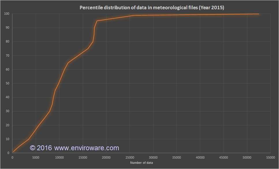
The percentile distribution of the number of measures within the meteorological files with more than 50 measures is shown below. The median of the distribution corresponds to 9856 measures, which is a bit more than one measure each hour of the year.
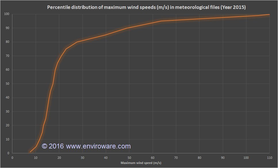
The percentile distribution of the maximum wind speeds (in m/s) within the meteorological files after filtering out all the values exceeding 250 mph is shown below.
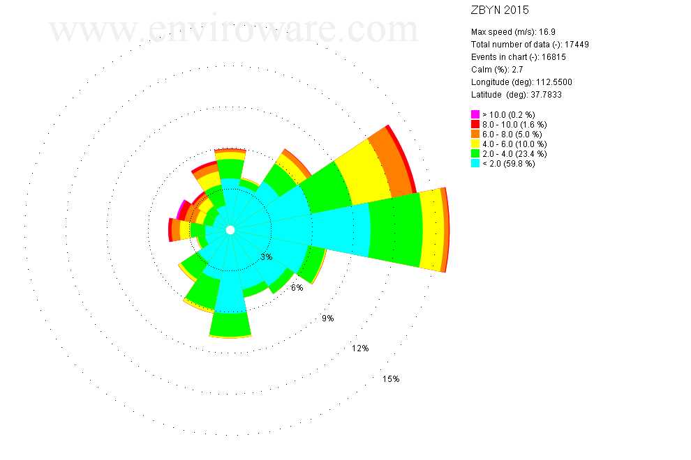
An example of the available wind roses is reported in the following image. The title indicates the ICAO code (four letters) or the IATA code (three letters) of the airport and the year to which the wind rose refers. Then there are some comments about the data: the maximum wind speed in m/s, the total number of data found in the meteorological file (including invalid records), the number of events in chart (only valid data without calms), the percentage of calms (calculated with respect to the total number of data) and longitude and latitude of the weather station. The legend represents the colors used for each wind speed interval and the corresponding percentage. The example image indicates, for example, that wind speeds between 2 m/s and 4 m/s are the 23.4% of the events, and they are represented in green, while only 0.2% of the events (purple) exceed 10 m/s.
If you need more professional wind roses and more complex analysis of your data, you might want to evaluate WindRose PRO.