The Google Earth tool for studying Air Quality
Premise
This text appeared for the first time in February 2008 on the Enviroware internet site. A PDF document of the original version is available.
1. Introduction
Any person involved in air quality studies knows that cartographic representation of data (input, output or measured) is very important, time consuming and, most often, difficult.
One of the difficulties is to find a suitable cartographic base over which the information (sources, sensible receptors, buildings, isopleths, etc.) must be represented.
Sometimes the cartographic base is available, but it is not georeferenced, therefore the user must try to reference it using the coordinates of some known points and the dimension in pixels of the image. This procedure may introduce some positioning mistakes.
When things go well, there are georeferenced images (for example tiff images with their world file or tfw files) which can be loaded in GIS systems. The drawback of the GIS systems is that their use presents some difficulties and they are expensive (with some noticeable exceptions of free systems, such as MapWindow and TatukGIS). Most often the cartographic georeferenced bases are very expensive. Since some years a new powerful tool, Google Earth (abbreviated with GE sometimes in the rest of the document), is available to (virtually) navigate over the globe, finding places and visualising information.
Google Earth is a computerised 3D representation of the world that uses satellite, aerial and geographic information system imagery combined with mapping software. Moreover, digital topographic data from NASA and other sources are used to model orography.
The Google Earth interface allows to insert very easily graphical and textual information, but the great power of the tool is the KML language (Keyhole Markup Language), which allows to show very complex information with a relatively simple syntax. Google Earth is a geographic browser, and the KML is its language, just as HTML is the language of the internet browsers.
Other geographic browsers exist, as for example Microsoft Live Earth and NASA World Wind, but this document focuses on Google Earth. This document describes some possible uses of Google Earth for representing Air Quality (AQ) data. In particular it shows how Enviroware uses Google Earth to represent AQ data in its air dispersion evaluation studies.
2. Applications
This paragraph describes some example application of Google Earth for representing AQ data. When more information is available on the internet, the links will be indicated, and only few comments will be given in the text.
2.1 Measured and estimated point data
2.1.1 AirNow
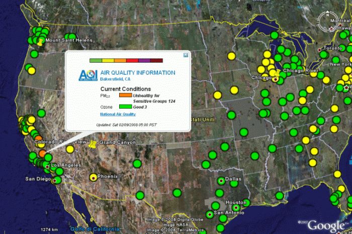
The U.S. EPA, NOAA, NPS, and other agencies developed the AIRNow Web site to provide the public with easy access to US air quality information. The Web site offers daily Air Quality Index (AQI) forecasts as well as real-time AQI conditions for many cities within the US. The AQIs are available as KML files and can be viewed with Google Earth. As can be seen by the figure, the user has a global information at a glance, looking to the colours of the circles, and can access more detailed information clicking on a specific point.
2.1.2 Air Quality data over Europe
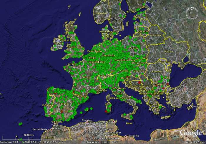
Air quality statistics of interest for the European Legislation for many pollutants and for years 1995, 2000 and 2005 are available as KML files from the Enviroware's web site.
The statistics are available for benzene, nitrogen dioxide and nitrogen oxides, ozone, lead, PM10 and sulphur dioxide. The KML files have been created starting from the information of the AirBase database. The following figure shows, as an example, the 2005 exceedances of the 1 hour limit value of SO2 over a great part of Europe. The red circles represent monitoring stations where the limit value has been exceeded more than the allowed number of times, and the green circles represent monitoring stations where the 1 hour concentration has been lower than the limit value (or has exceeded the limit value for less than the allowed number of times). The map indicates that the limit has been respected over almost the whole Europe, with few exceptions in South Sardinia (Italy), Spain, France, Bosnia Herzegovina, Slovenia and Bulgaria. Detailed information on the monitoring station (station code, location, number of exceedances, characteristics of the stations, limit value, percent of valid data) is displayed when the user clicks on a specific point. The information is organised by country, therefore the user can choose to visualise only some countries by clicking over the corresponding layer.
2.1.3 UK Air Quality Archive
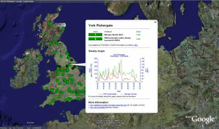
The UK Air Quality Archive allows to view in GE the latest data and information for all automatic air quality monitoring sites in the UK national network. All the data is automatically refreshed every hour. Circles of different colours over the map indicate the position of the AQ monitoring stations and their pollution level. Clicking over a point will display more detailed information, including a weekly graph of pollutant levels. An example is shown in the image.
2.1.4 Emission inventories
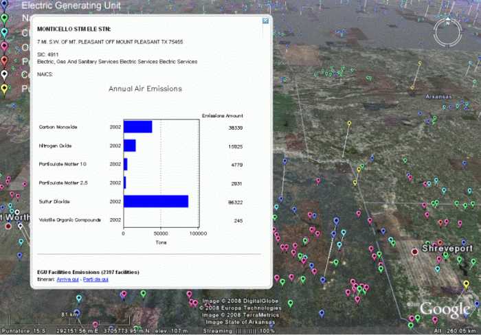
The US-EPA makes available point sources emissions information as KML file.
The KML file contains facility level information for the seven major point-source sectors: cement facilities, chemical manufacturing, electric generating units, natural gas pipelines, oil and gas production, petroleum refineries and pulp and paper industries. Each facility is shown as a balloon which height over the ground is proportional to its emissions, therefore tilting the view allows to immediately identify the bigger emitters.
The following figure shows a tilted zoomed view of the point sources KML file, and the detailed information about a facility, which shows up after clicking on the corresponding placemark. The US-EPA shows only the point source emissions over GE. It is of course possible to show area emissions using polygons and mobile emissions using lines. Polygons and lines can be represented with different colours depending on their emission levels, and detailed information can be displayed by clicking over them.
2.2 Meteorology
Many meteorological information can be shown on Google Earth. The software itself contains a layer which allows to show some meteorological information. Within this layer, there are three sub-layers that demonstrate how the weather looks in selected areas. The layers are called as Clouds, Radar and Conditions and Forecasts. The Clouds layer is provided by the Naval Research Laboratory in Monterey, and the Radar with the Conditions and Forecasts layer is powered by weather.com.2.2.1 Wind fields
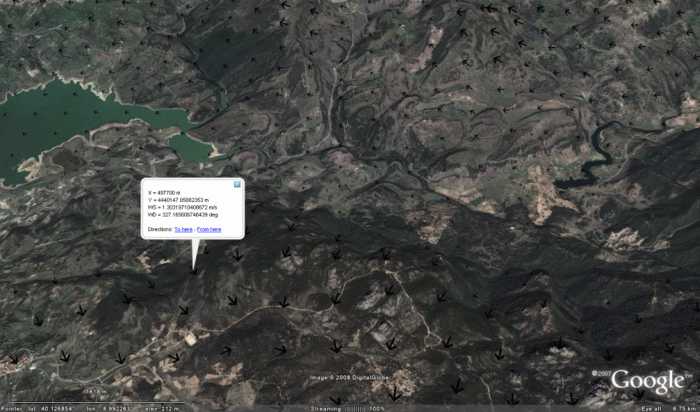
When carrying out an atmospheric dispersion study, it is important to visualise the meteorological fields, in particular the wind fields for selected times. For example, when using the US-EPA recommended CALMET/CALPUFF modelling system, it is important to visualise the wind field reconstructed by CALMET before applying CALPUFF. This can be done with a KML file which shows vectors of specific directions and whose intensity is indicated by their lengths and/or colours. An example of wind field at 10 m above the ground as reconstructed with CALMET for a portion of domain is shown in the image.
2.2.2 Wind roses
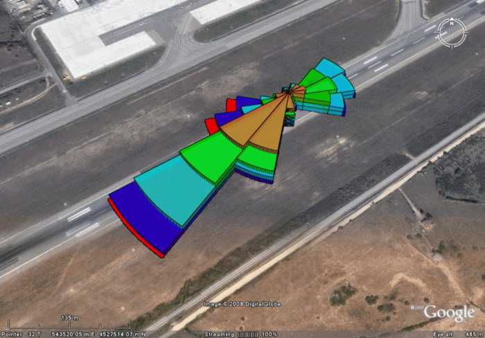
A wind rose is a graphic tool used to give a concise view of how wind speed and direction are typically distributed at a particular location, therefore wind roses summarise the occurrence of winds at a location, showing their strength, direction and frequency.
Wind roses are important in air quality studies, but they are also essential when placing wind turbines, designing airports and designing energy saving buildings. Wind roses can be described by KML files and visualised in Google Earth over aerial imagery. The KML files representing wind roses for some airports of the world, created processing METAR data, are available at in the Enviroware internet site.
A tool which analyses wind data, creates wind roses and automatically creates 2D or 3D wind roses in KML format is WindRose PRO. An example of wind rose created by WindRose PRO in KML format and loaded in Google Earth is shown in the image. The wind rose appears 3D due to the tilting.
2.3 Dispersion models
Google Earth is a useful tool to define input data for dispersion models, to represent their output and to verify both input and output. In the following paragraphs some examples will be shown.
2.3.1 Collecting input data
Google Earth can be used to verify the correct positions of existing sources and sensible receptors. The user is helped in this effort thanks to the possibility to switch the coordinates from lat/lon to Universal Transverse Mercator (UTM), which are used by many dispersion models. Other input data, such as the coordinates of buildings for describing the building downwash effect, can be collected using Google Earth.
2.3.2 Input preparation and verification
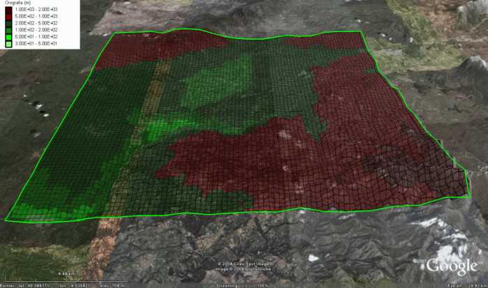
GogleEarth is also useful to verify the correctness of input data prepared for the atmospheric dispersion models. For example, orography interpolated over grid cells of given sizes can be viewed superimposed to the 3D orography of GE to verify its correctness (e.g. correct representations of valley and peaks, correct representation of coastlines, etc.). The image shows an example of orography prepared interpolating values within a database with 30sec resolution, and superimposed to the 3D orography of GE. The outer green line represents the limit of the simulation domain.
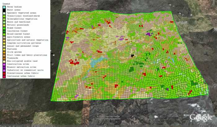
The grid plot representation is useful also for checking other input variables, such as the land cover. The land cover plot in GE allows to verify the correct assignments to the model grids; for example it allows to verify that water cells (lakes, sea, etc.), built up cells, forest cells, etc., are correctly assigned. This task can be done assigning different colours to the cells and a degree of transparency (i.e. opacity below 100%), so that it is possible to view the satellite image below the land cover representation. The image shows as an example the land cover representation obtained processing the CORINE database over a specific simulation domain. It allowed to verify the correct representation of a relatively big lake in the south-western part of the domain, and even to recognise a small burnt area (in black close to the domain centre).
2.4 Visualisation of the model outputs
Atmospheric dispersion models produce outputs which require different representations. In the next sub paragraphs some types of output representations within GE will be shown. These representations are routinely used by Enviroware in its atmospheric dispersion studies and for debugging purposes when developing or testing atmospheric dispersion models.
2.4.1 Contours and grids
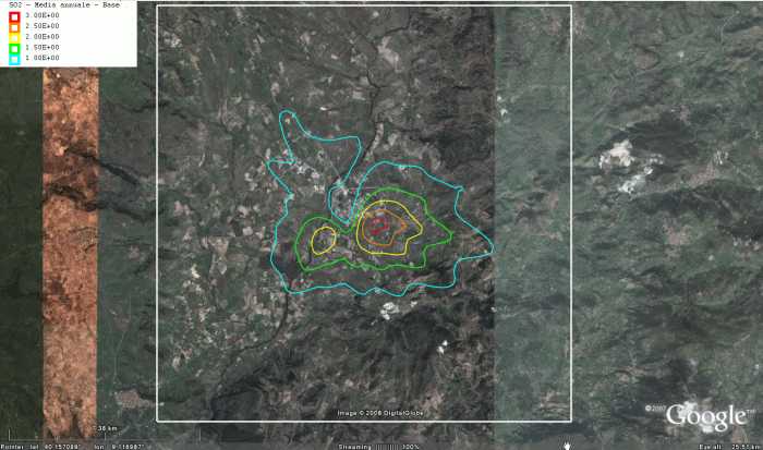 Predicted concentrations and deposition fields can be represented over Google Earth as grids or contour plots. The grid representation is effective to show the locations where specific limit values are exceeded. For example a grid representation could be used to show the cells where a dispersion models predicts more than 18 exceedances of the 1 hour EU limit value of 200 ug/m3. In order to prepare plots like the one shown, it is needed a software capable to process the output binary file of a dispersion model (e.g. CALPUFF, AERMOD, ISC3 Short Term or Long Term) to get all the relevant statistics (hourly maximum, daily maximum, percentiles of of 1-hour average concentrations and of of 24-hours average concentrations, number of exceedances of a given threshold, running averages of a specified number of hours, and others).
2.4.2 Trajectories
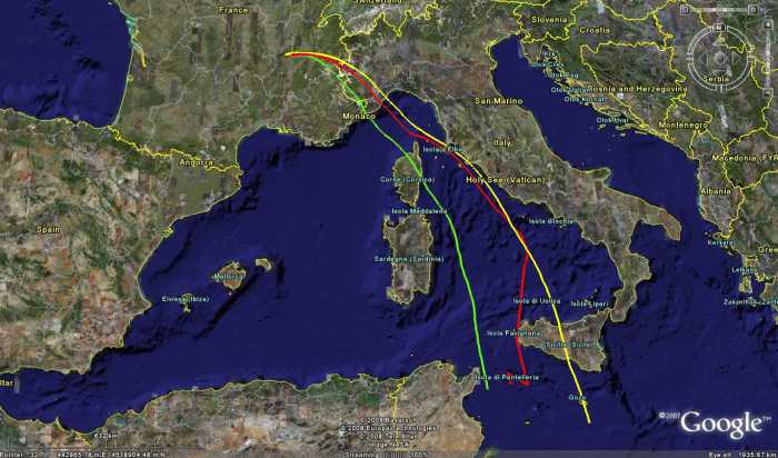
Google Earth is also used to show the trajectories of pollutant parcels. As an example, the image shows the trajectories of three computational particles emitted by the Long Range Lagrangian dispersion model APOLLO2 (which will be used by the Italian I.S.P.R.A. to manage radiological emergencies). The particles are emitted by the same source with temporal distance of few seconds.
2.4.3 Particles
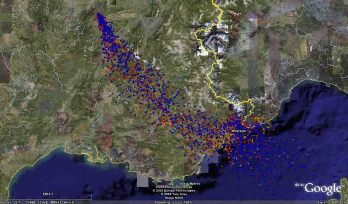
Not only trajectories, but the particle positions at fixed times can be shown in Google Earth. The image shows the positions of the computational particles emitted by the APOLLO2 dispersion model. Different colors represent particles with different heights above the ground. By tilting the view of Google Earth, the particles are represented in 3D with their actual height above the ground. A box with the properties of a particle (lat/lon coordinates, height, age, mass of each component, and others) is shown clicking over it.
3 Conclusions
This document has shown some example of how Google Earth can be used as a powerful tool by the atmospheric dispersion community to show 2D and 3D fields. Of course there are many other possible applications which are not mentioned above and could be described in future revisions of the document. The document did not mention the time trends of variables, but it is possible to show them for specific variables clicking over a given position. For example a placemark could represent the position of a discrete receptor of a model, and clicking over the placemark the time trend of the concentrations predicted at such location would pop-up. A more dynamic example concerns the concentrations measured from a monitoring stations whose KML file describing the time trend could be made available practically in real time through internet.
One of the reasons of the power of the Google Earth tool is that there are layers of information which are always available within the software, and other layers which are made available by the users. The layers provide the ability to overlay additional geographic information like roads, topography, and landmarks.