How to use the simple on line wind rose tool
Introduction
A wind rose is a chart which gives a view of how wind speed and wind direction are distributed at a particular location over a specific period of time. It is a very useful representation because a large quantity of data can be summarised in a single plot. This type of plot can be used not only to plot wind speed against wind direction, but to plot any variable which depends on wind direction, as for example the average or the maximum wind speed measured over a time period. If a monitoring station measures both wind and concentrations of air pollutants, it is possible to plot the concentration levels of a specific pollutant against wind direction to investigate if higher levels could be related to any specific source.
Wind roses contain important information and are used in different fields as, for example, in air quality studies, in designing energy saving buildings, and in positioning wind turbines.
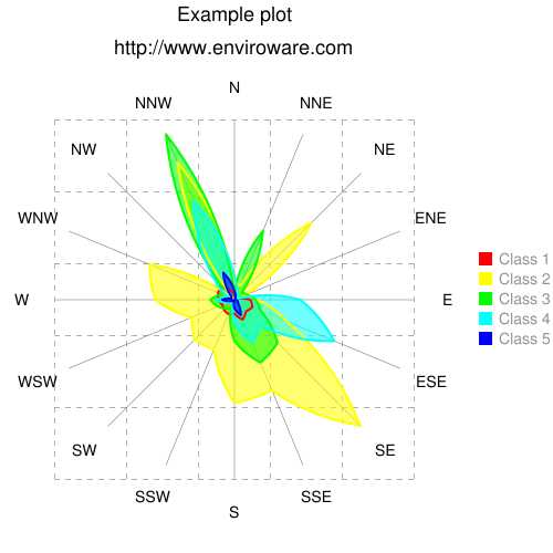
The simple on line tool available in this web site allows to create wind roses with 16 directions, each one representing an arc 22.5 degrees wide. The first direction is centred on North (i.e. 0 degree), and the last one on NNW (i.e. 337.5 degree). As usual, the wind direction represents the direction from which the wind blows. The colours of the wind speed classes cannot be modified, they are red, yellow, green, cyan, and blue.
Two examples of usage of the tool will be shown in the following.
Example of usage: wind rose
When used for plotting a wind rose, the on line tool requires that the joint frequency distribution of wind direction and speed must be inserted. Therefore the user must analyse the wind data, group them according to the 16 direction, and then according to the wind speed classes adopted. This binning of the wind data is not done automatically by the on line tool, while other software packages (e.g. WindRose PRO) are capable to create the wind rose directly by reading the wind data in many formats.
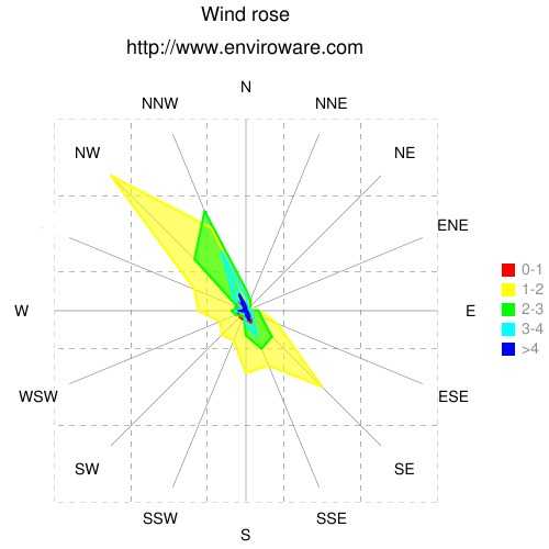
When you access the page of the on line wind rose tool, some data are preloaded and, to save time, we are going to use such data in this example. Anyway, you can modify such values according to your needs. The first step is to assign a title to the plot we are going to create, we must write it within the Plot title text box, as an example we will simply write Wind rose. We will leave the Smoothing check-box unchecked. On the contrary, all the Draw check-boxes and the Fill check-boxes will be checked, so that the data of all the five columns will be represented and filled. We will change the text of the Labels, which will be used for the legend, inserting for example 0-1 in place of Class 1, then 1-2, 2-3, 3-4 and >4 in place of Class 5.
Click the Proceed button, and you will obtain the following plot. Try to uncheck some of the check-boxes to see how the plot changes.

In a wind rose the length of each arm is proportional to the number of events, or the frequency, at which wind was observed from that direction. For a specific direction, the different wind speed frequencies sum up to give the total length of the arm. The wind rose plotted with the on line tool does not have such feature, since all the frequencies are plotted starting from the centre of the plot, therefore it is more properly a radar plot.
Example of usage: average wind speed
Now suppose you want to plot the average wind speed for each direction. In the Plot title text box write Wind speed. Since there is only one variable to plot, only one Draw check-box must be checked, we will check only the first one. Uncheck the corresponding Fill check-box, so that the curve will be not filled. In the first label insert Average. Then fill in the first column with the following values for the average wind speed 1.3, 1.5, 2.5, 3.3, 2.6, 1.8, 1.7, 1.4, 1.3, 1.7, 2.0, 2.0, 2.3, 1.3, 1.1, 1.0. The values are in m/s and have been calculated using WindRose PRO starting from hourly data for a whole year. The average wind speeds must be inserted from N to NNW, so that 1.3 m/s is the value corresponding to N, and 1.0 is the value corresponding to wind coming from NNW.
Click the Proceed button, and you will obtain the following plot.

This same procedure can be followed for plotting air pollution concentration data if their average, or peak, values are known for each direction.